02 — Product platform
Madame Pee
Because every woman’s needs count
The challenge
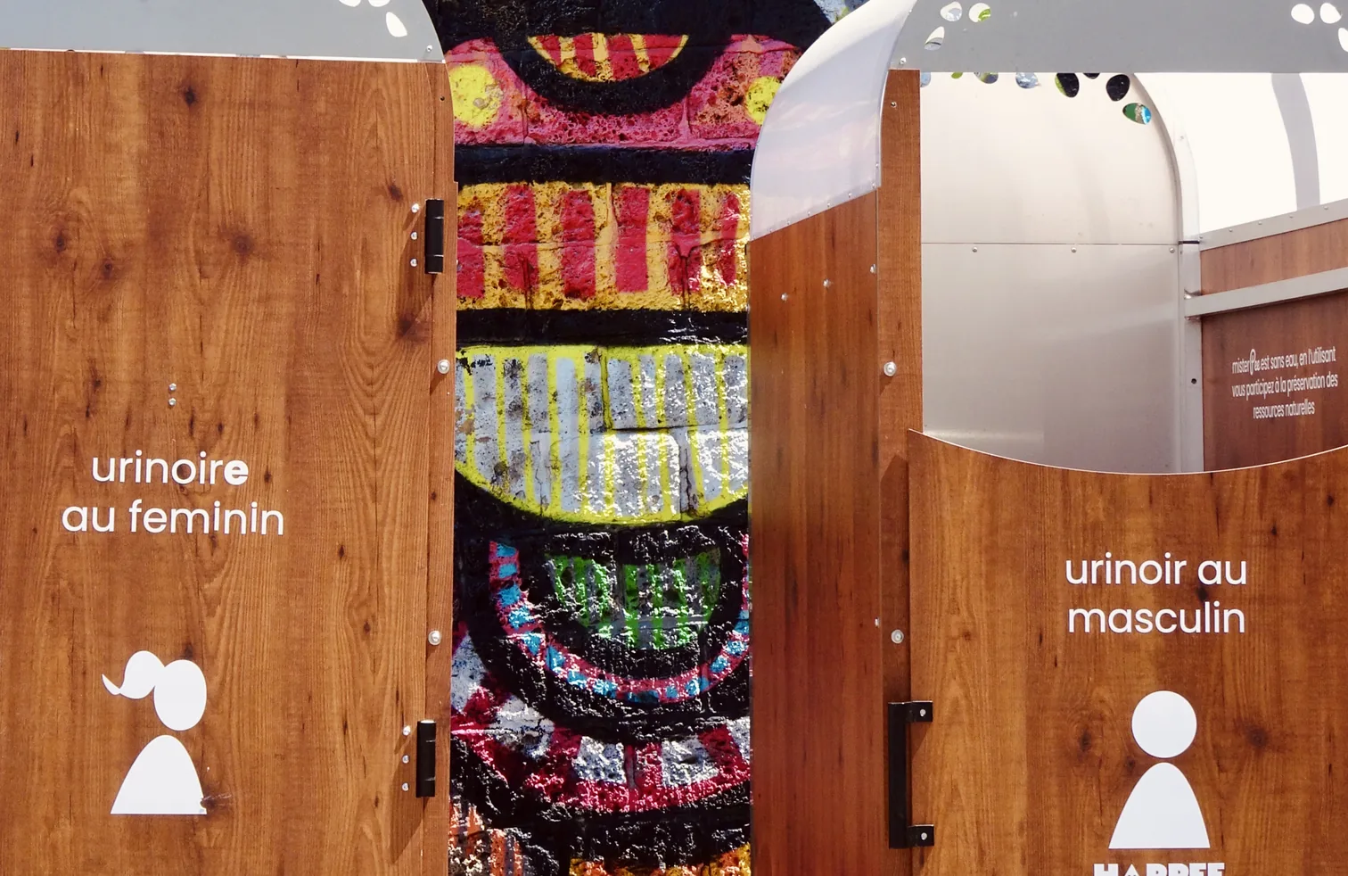
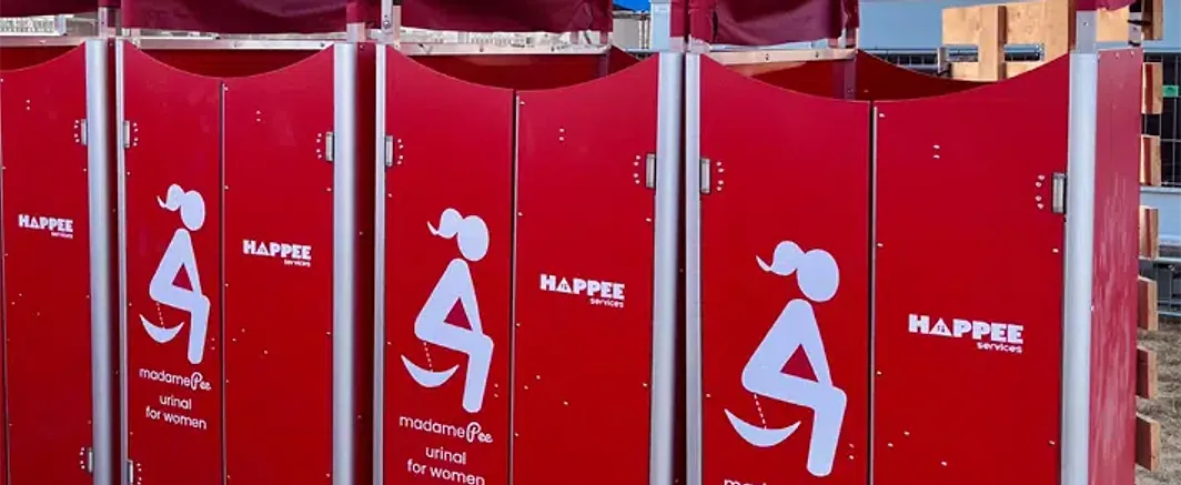
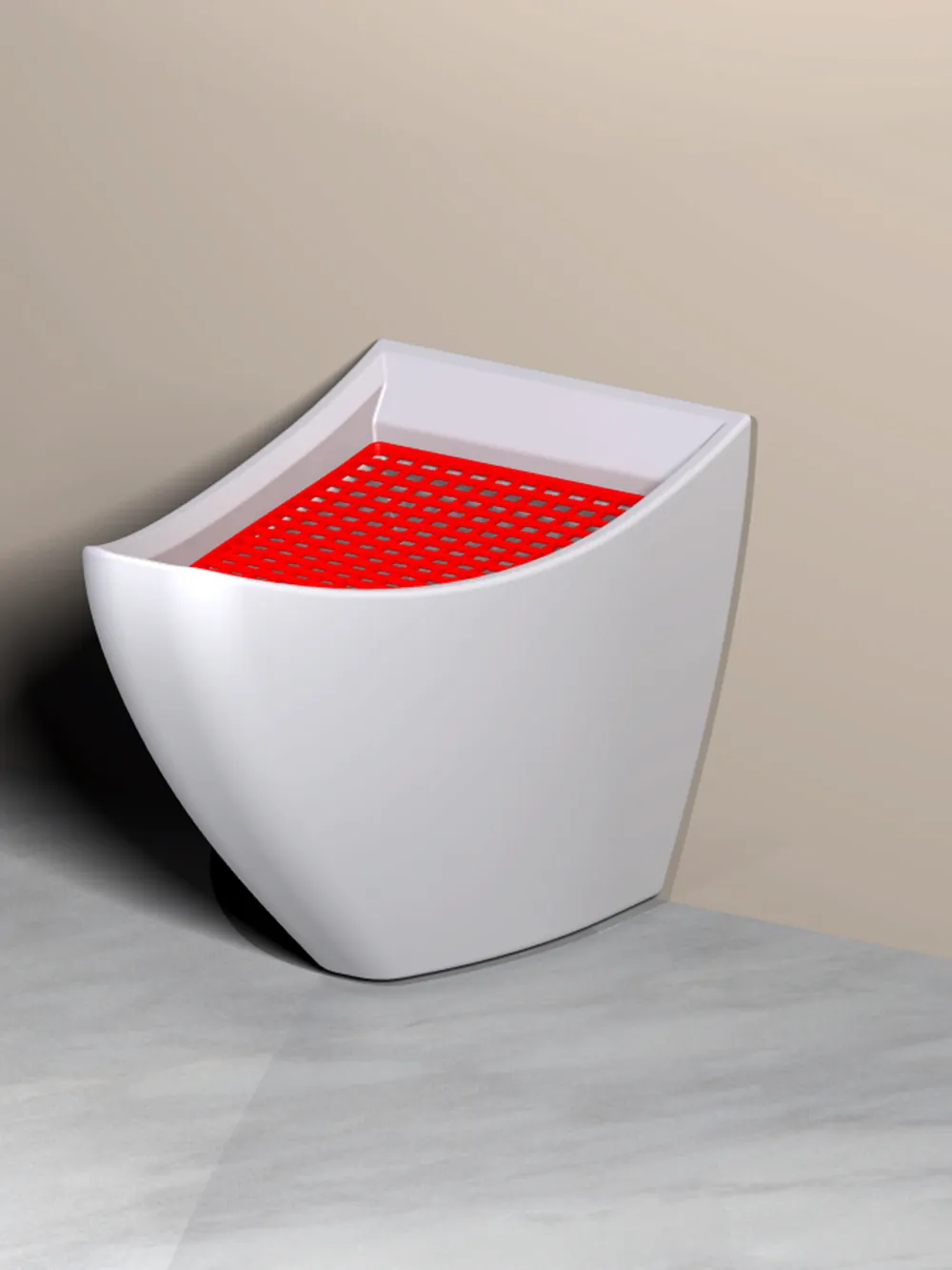
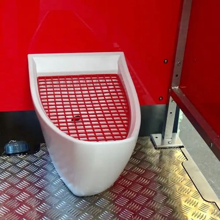
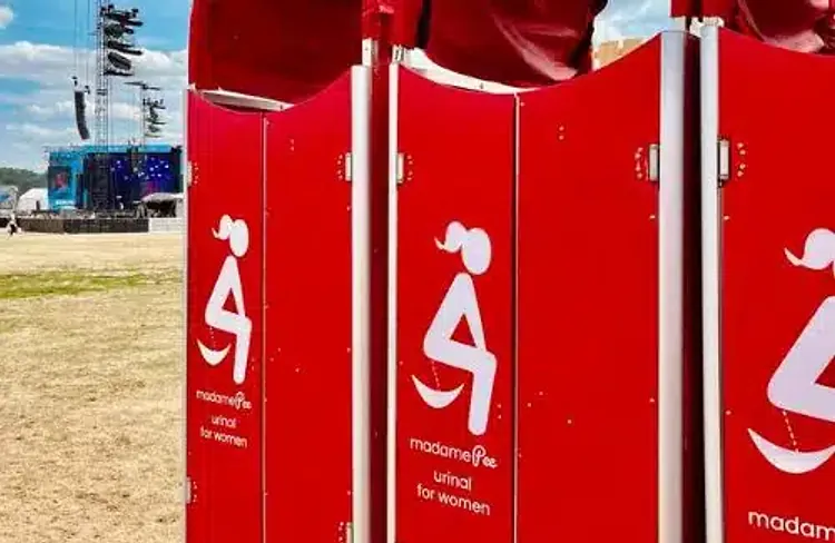
Madame Pee makes female urinals for festivals and public spaces. They needed a platform that could list every unit in France, stay useful at three in the morning on a festival field with one bar of signal, and still look like the brand people had met on site.
The response
A location-first platform where the map is the product and the editorial layer wraps around it. Everything above the fold is text and coordinates; imagery streams in behind it. The brand shows up in the type and the motion rather than in heavy hero art.
01 — Approach
Design for the worst signal, not the best screenshot.
The real usage context is outdoors, at night, in a crowd. So the first paint carries the whole answer — nearest location, distance, opening state — as text. Imagery, maps and transitions arrive afterwards and enhance rather than gate.
02 — Design system
A brand that survives being useful.
The identity is loud and pink; a utility can’t be. I kept the accent for a single job — indicating availability — and let a warm neutral carry the rest. That one rule is what stops the site reading as a campaign page.
03 — Development
React, a live API, and a strict image budget.
Locations come from a live API through a context layer with optimistic caching, so panning the map never blanks the list. Every photograph is served responsive, lazy and format-negotiated — the median page weight landed under a third of the original build.
04 — Outcome
A directory people actually open in the field.
The platform became the reference listing for the network, and the image budget kept it usable on a saturated festival network — the condition the whole thing was designed around.
Stack
- React
- REST API
- Context API
- Responsive imagery
Services
- Frontend development
- UI / UX design
- Image optimisation
- Responsive
Images
- Product and event photography — madamePee
Start something